Peak is an app for outdoor enthusiasts. Its aim is to provide a quick and easy way to keep track of all your outdoor activities and get inspiration for where to go next it. Its main functions are:
- Find campsites and hiking trails nearby or by location
- Keep track of campsites and hiking trails you've explored
From UX research previously carried out, the target audience was determined to be:
- Ages 20-35
- Male and female
- Students and professionals who enjoy the outdoors
After receiving the brief, I started thinking about the true aim of this app. In other words, what were users really trying to get at by using this? Reflecting on the culture and values this app should embody, I distilled the Why? down to the following phrase:
"To experience a oneness with nature"
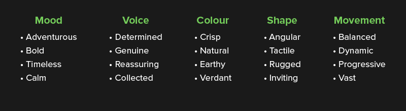
I wanted to explore the adventurous, outgoing side of Peak's target audience—the types who really wanted to just get out there, experience the great outdoors. But to balance that boldness, I also wanted to capture the sense of calm and peace one feels with being at one with nature, but still with a confident, positive, and engaging voice.
When I imagined the great outdoors, crisp, natural, and earthy colours came to mind, as well as rugged landscapes, objects with tactility, but shapes that were still inviting.
For a sense of movement, I wanted to contrast the rugged and angular feelings with elements that were smooth, balanced and gentle—similar to how a river flowing down a mountain can ground its imposing character.
From these ideas I established a framework for the visual language:


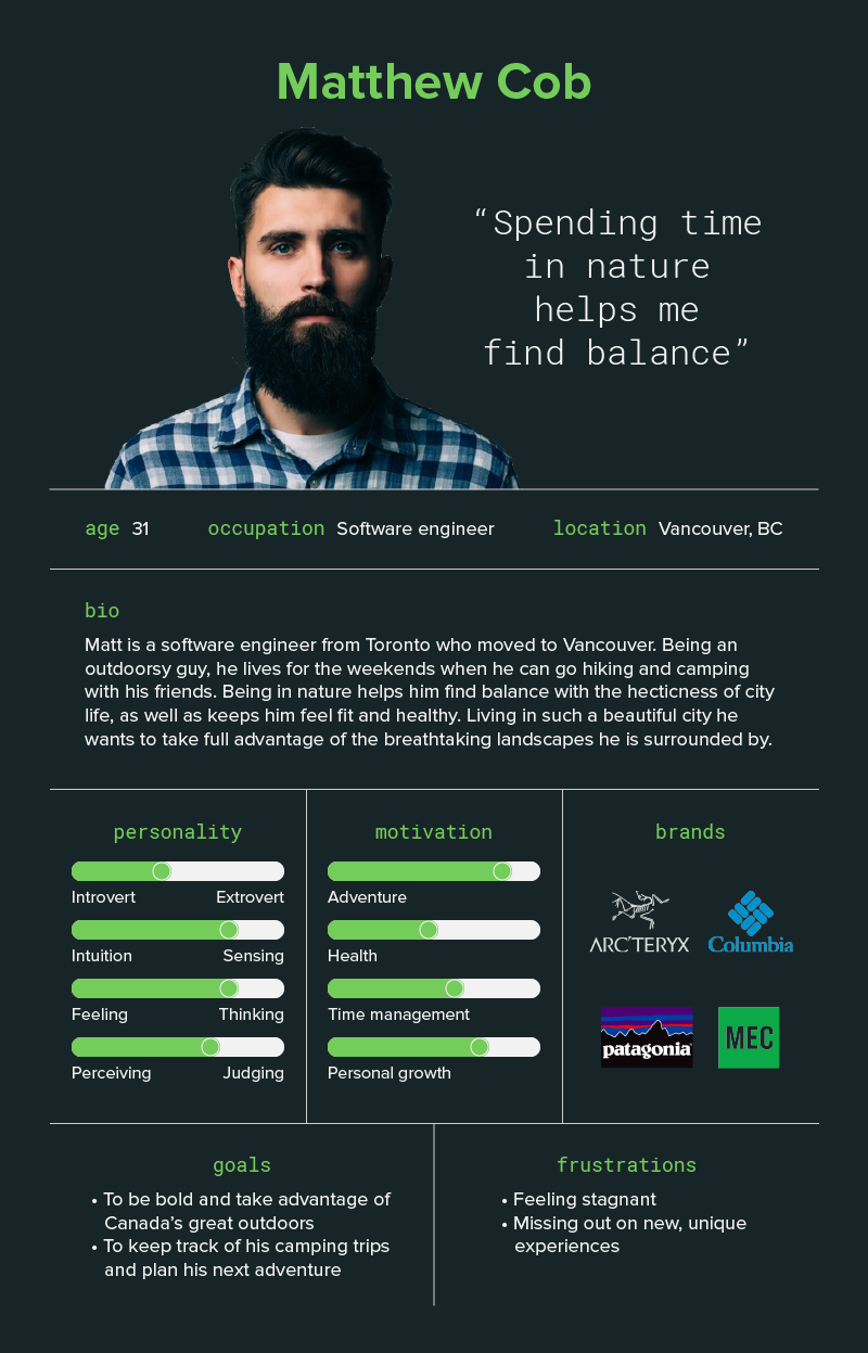
Wanting to get a better sense of the motivations, frustrations, needs, and goals of the target audience, I created a user persona, Matt.
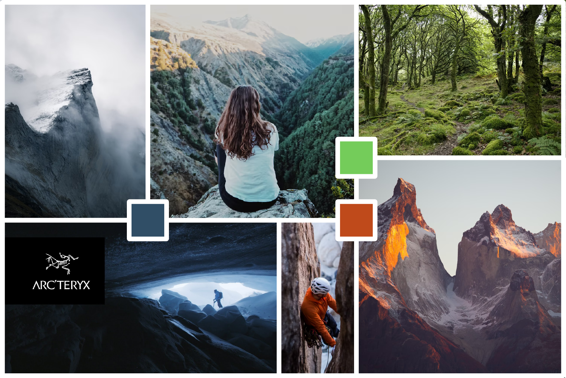
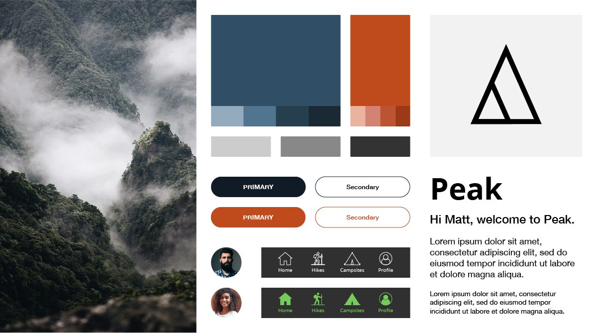
I decided to go with dark blue as the secondary colour to capture a cool and crisp colour space, with orange as the accent for a warm pop, and bright light green as a secondary accent to be used sparingly. All this set against grounding and earthy shades of light and dark grey.
For the main typeface I chose Helvetica Neue for its clear, timeless, and readable forms, balanced by an open and friendly secondary font like Open Sans.
These were the mid-fidelity mockup screens I was given to work with:
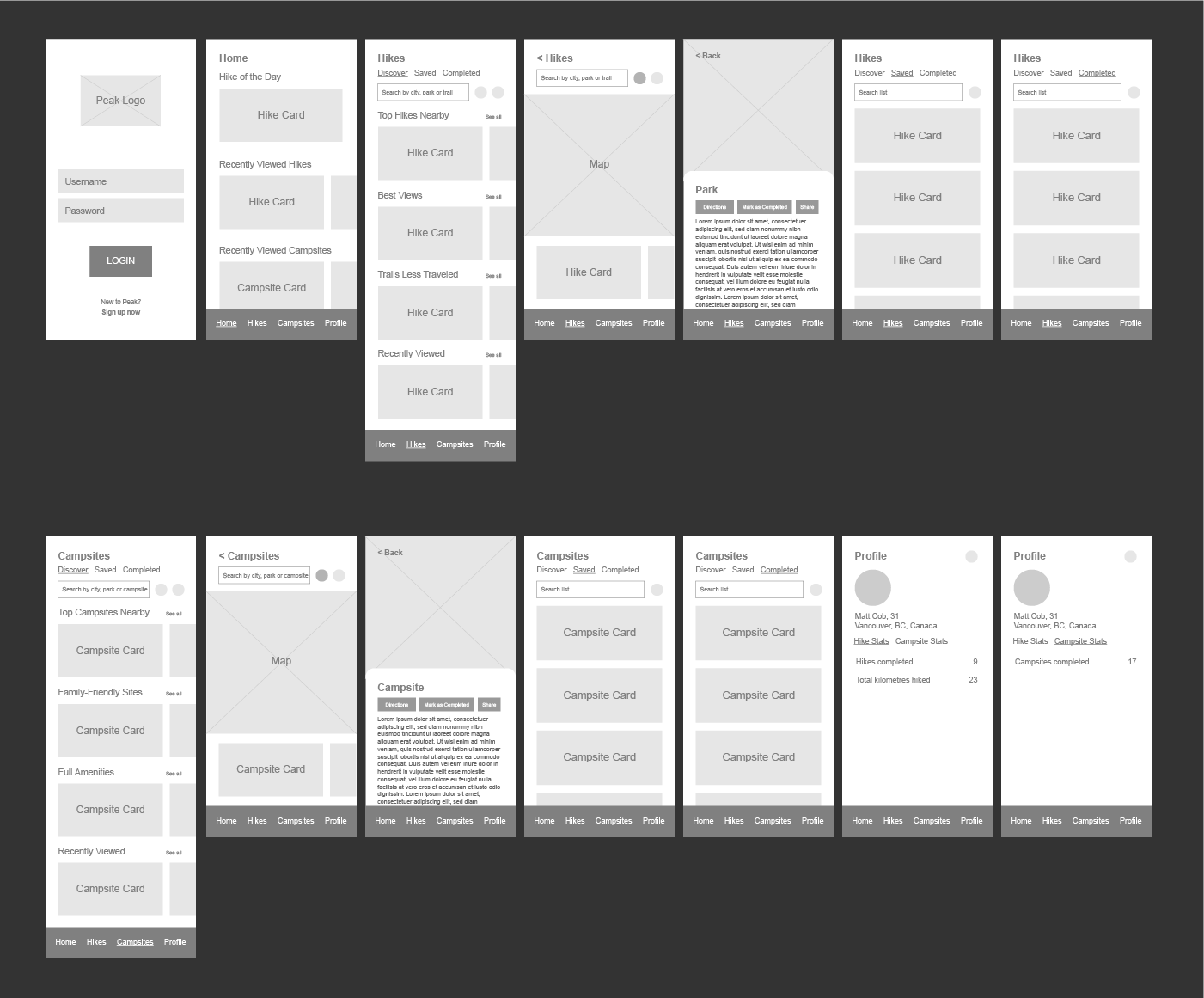
From here I could (finally!) start working on the designs using the visual vocabulary I'd built.
Without further ado, the final designs were as follows:
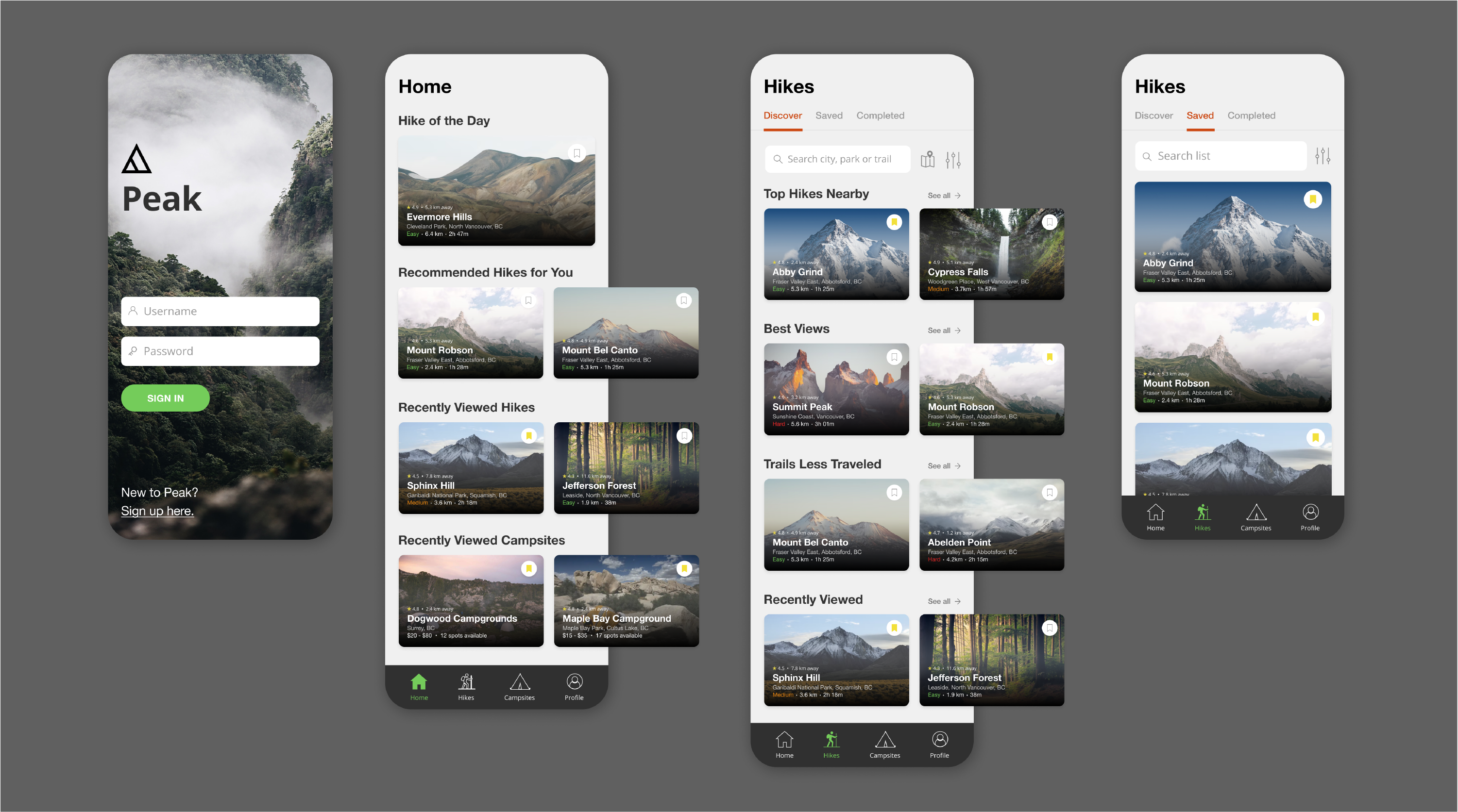
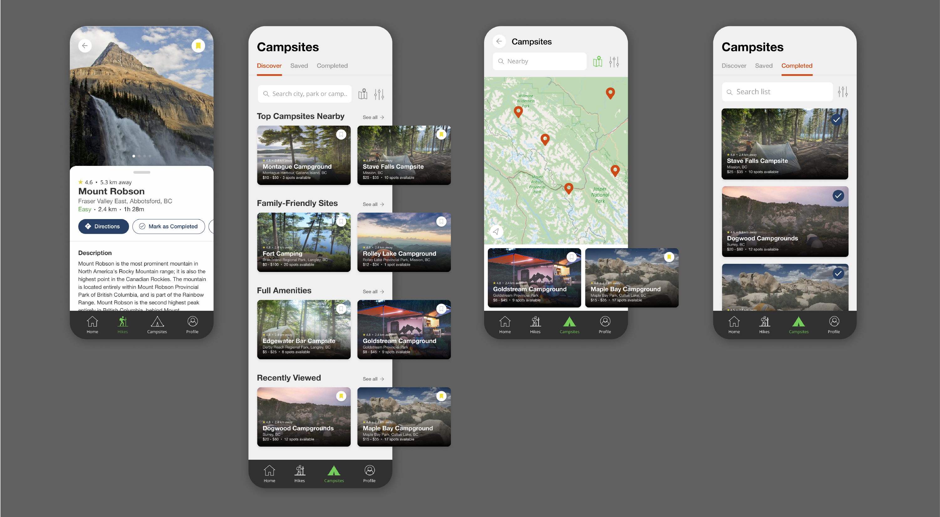
The shots here depict the final iteration. From left to right, top then bottom row:
- First, we have our Sign In screen, with a nice big picture of a luscious, yet mysterious, verdant forest to invite users in.
- The Home (dashboard) displays trending and personalized hikes picked for the user based on their viewing history. They can also quickly revisit hikes and campsites they were looking at previously.
- The Discover page (for both hikes and campsites) allows user to search for hikes, as well as provides recommendations of nearby hikes in three categories. By default hikes are shown in List View.
- In the top right corner of every hike/campsite card is a bookmark button for places user would like to save. Saved hikes can be found under the Saved tab, with the option to search and filter the list.
- Clicking a hike (or campsite) brings to the Details page, with the options to navigate, mark as completed, share, and learn more information.
- The Discover page for Campsites is very similar to its Hikes equivalent, differing only in the categories and information shown.
- Under Discover, users can also search in Map View for a more visual experience.
- Campsites (/Hikes) that were marked as Completed can be found all in one place.
Click here to see the Figma prototype for this app!
Designing this app was an incredibly enjoyable experience. I got to explore my own design direction to its fullest extent, and it was refreshing change that I could focus purely on building the best, most elegant, and fun user interface (that being said, the UXer in me couldn't help but come out on occasion). Some future considerations:
- Exploring additional ways of displaying the Map View.
- Optional dark theme. Super trendy at time of writing, and something that might fit this design well, perhaps further emphasizing that bold, adventurous, undeterred spirit.
Thanks for reading!